I Created Movie-Watching Website With ChatGPT

ChatGPT Web Design: See how I used the free model to create a detailed movie site layout prototype. Learn the essential multi-step prompting method—this is a design blueprint, not a playing website.

Premium Hero Image

Chapters

Introduction Functionality Of Website Navbar Hero Section Basic Example of Prompt All Series (All/Category + Filters) Section Footer Section Conclusion (Link of Website) Summary Of Blog

Introduction

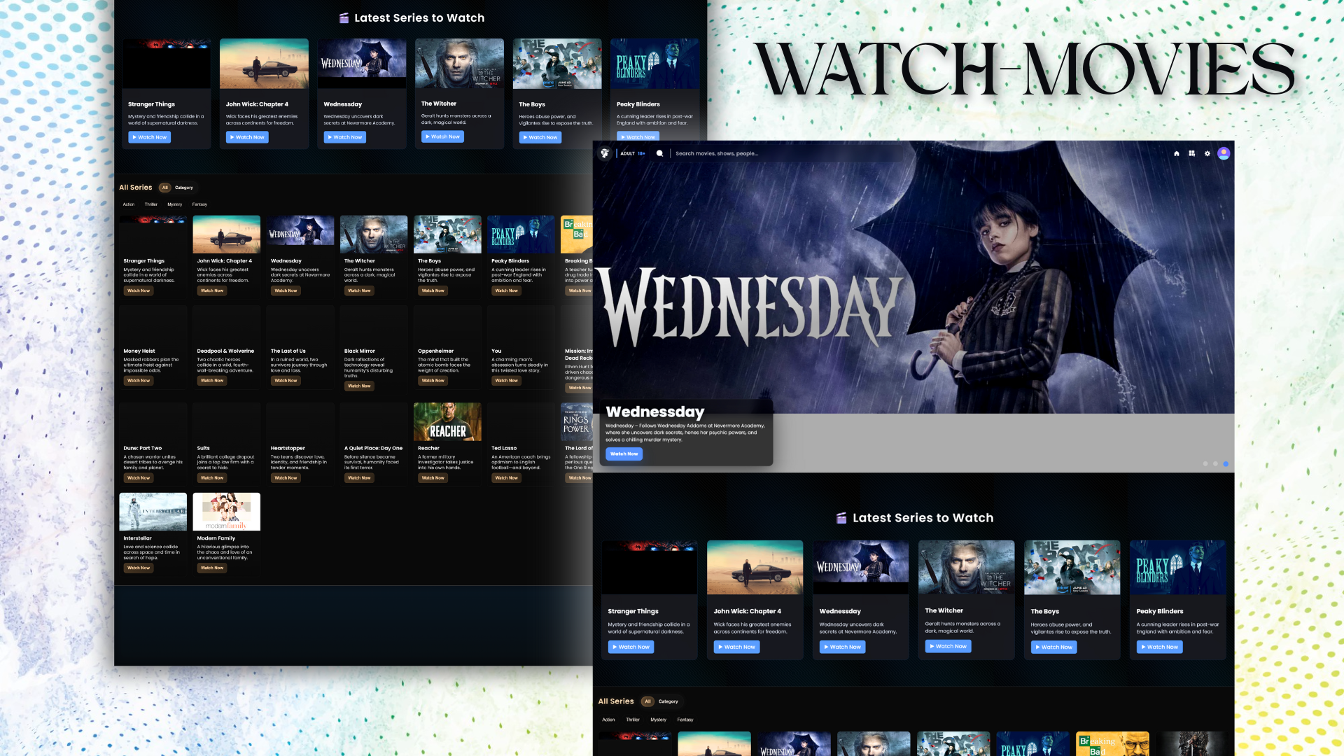
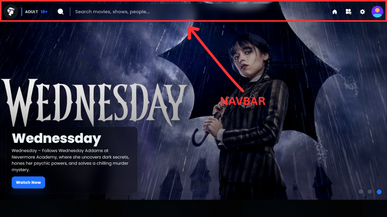
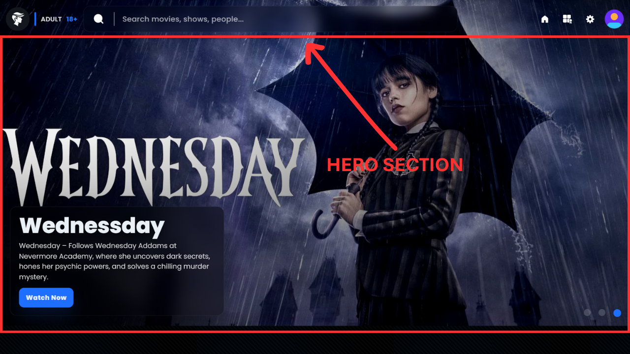
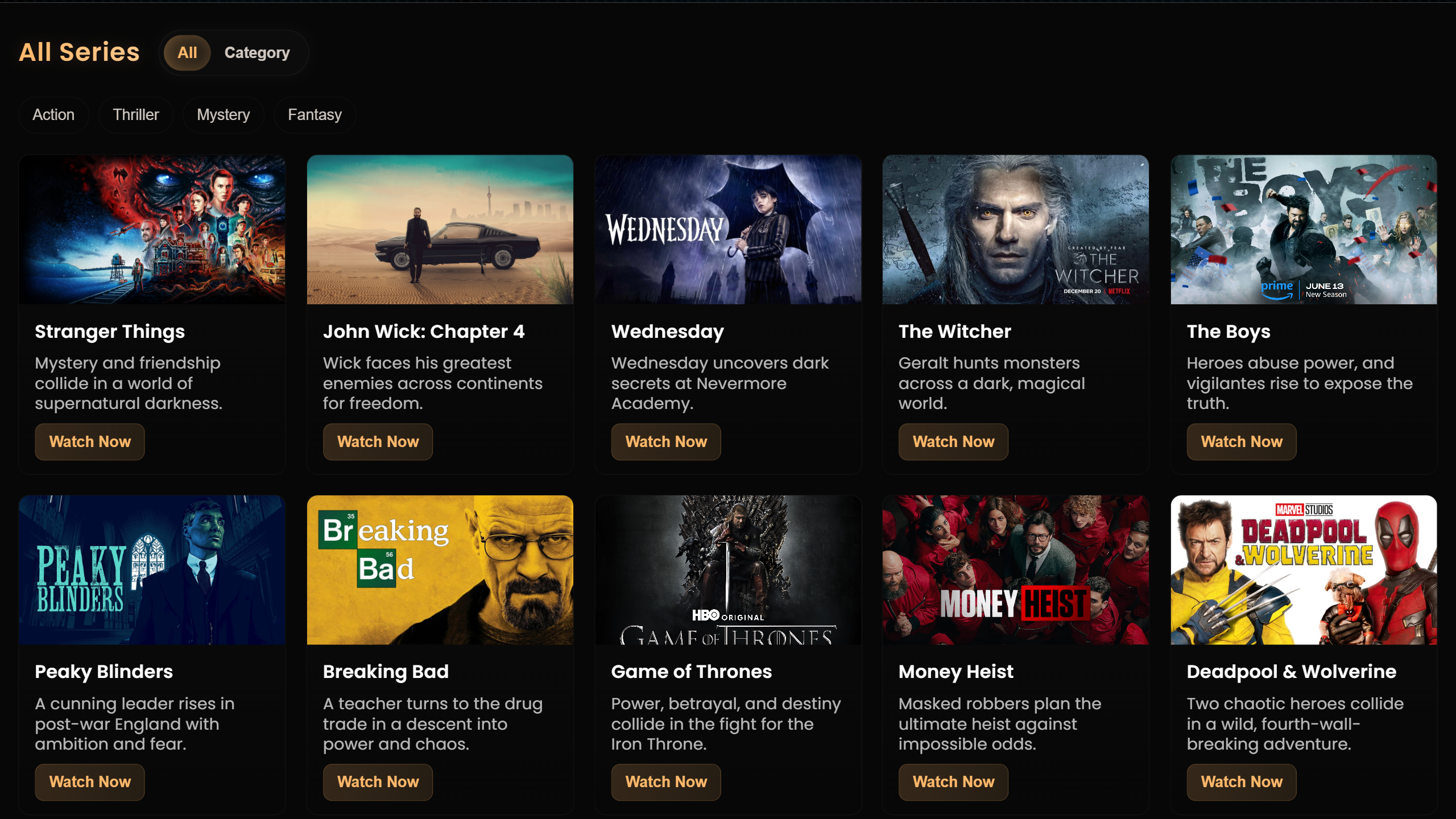
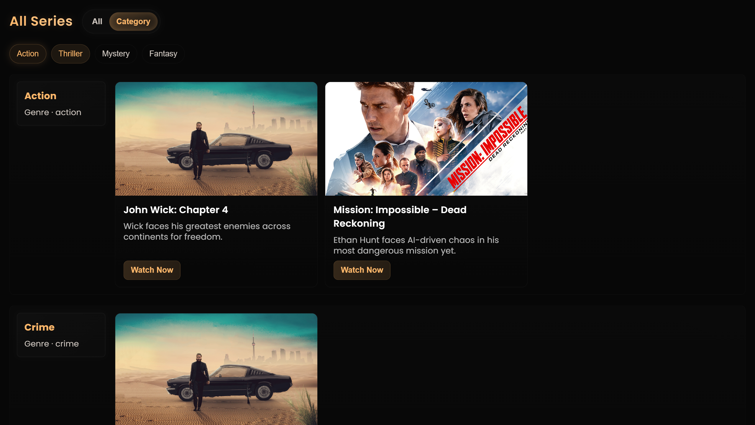
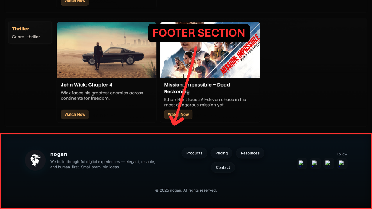
This introductory post kicks off an exciting exploration into front-end web development by guiding you step-by-step through the process of building a movie-watching website prototype with direct assistance from the free ChatGPT AI model. Our comprehensive design is structured across three primary functional zones. We begin with the foundational view, integrating both the essential responsive navigation bar (navbar) and the visually compelling hero section, forming a cohesive first impression. Next, we pivot to the dynamic Latest Movies section, optimized for showcasing newly added content. The true highlight and most intricate piece of this project is the fully interactive All/Category Slider. This challenging feature demonstrates advanced functionality, allowing seamless toggling between a full directory of listed movies and refined filtering based on specific genre categories. Finally, the prototype concludes with a standard, clean footer. While this project is intentionally focused on single-page design and intricate client-side functionality—meaning it serves purely as a non-functional design prototype without actual streaming content—the practical skills and advanced design patterns you will master by reading this entire tutorial are genuinely surprising and incredibly valuable for any aspiring web developer.

Functionality Of Website

This second section dives into the core front-end functionality of the website prototype, distinguishing it significantly from simpler projects. Responsiveness is a critical starting point; the site is optimized to work perfectly across mobile devices, ensuring users experience a tailored view that doesn't feel like a scaled-down desktop version. A key functional feature is the search bar, which dynamically displays "search containers." For instance, searching "horror movies" immediately presents related content like Stranger Things, complete with the category, description, title, image, and a 'Watch' button. These results utilize a max-height fixed container for smooth, scrollable viewing of multiple results. The Hero section features dynamic content through shuffling images with CSS transitions, ensuring each rotating image presents unique accompanying text. While the Latest Series to Watch section includes basic, clean functionality—such as refined hover effects—the most sophisticated features reside in the All and Category Slider section. This slider allows immediate application of advanced filters (four are currently preferred and will be detailed later). Applying any combination of these filters immediately refines the displayed movies. The "All" view lists every movie simply, allowing filter application across the entire library. Conversely, the "Category" view sorts the entire library by genre, offering a structurally different way to apply those same filters. Finally, the site concludes with a simple, universally familiar footer.

Hero Section

Let's dive into the detailed layout of our initial Hero Section, a critical element for maximizing user experience (UX) and establishing immediate authority—a key component of building a high-quality blog that adheres to modern web standards, reflecting principles similar to Google EAT. Currently, the design incorporates three captivating, high-quality images, although the setup is readily scalable for future content expansion; for this initial prototype, we are prioritizing load speed and clarity. Each of the three visuals is designed to feature separate, engaging content; for instance, a specific image might highlight a "Wednesday" event, complete with a concise, compelling description and a dedicated "Watch" button positioned just below its textual overlay. The core structure is defined by a large, visually striking container that dominates the viewport. This container utilizes the trendy glass morphism effect, creating a sleek, semi-transparent overlay that makes the content feel integrated yet distinct from the background. Crucially, the entire visual display offers an interactive design element: the internal images respond subtly to your cursor's position, exhibiting a gentle parallax scrolling effect. If you subtly move your mouse upwards, the images inside will gently shift downwards, adding a delightful, immersive layer to the front-end design that significantly boosts engagement. Finally, positioned in the bottom-right corner of the section, you will find three small navigation dots—these serve as manual controls, allowing the user to seamlessly shuffle content and browse the featured items. These controls are dynamically generated and will extend or decrease in number based on the total count of active images, ensuring a clean, adaptive interface for optimal conversion rate optimization (CRO). This complete presentation details the full layout; there is no further complexity in this specific section, and now, in the subsequent part of this web development tutorial, I will provide a basic code prompt to help you recreate a fundamental structure like this.

Hero Section of McDonald's redesign

Basic Example of Prompt

Chatgpt Prompt: "Could you design and code an interactive, fully transparent navigation bar paired with a dynamic, image-shuffling hero section? First, in the navbar, I need my logo, logo.png, displayed as a perfectly circular image with an exact 50% border-radius. This should be followed by a vertical, blue-colored divider with slightly rounded corners. Next to the divider, please display the text "Adult 18+" to indicate the account type. The central element of the navbar should be a wide, 600px search bar. I'd like this search bar to start with a magnifying glass icon (search.png), be separated by another divider, and feature a subtle glass morphism effect. On the far right, include three distinct navigation buttons: Home, Category, and Settings, immediately followed by a non-functional Profile icon. The entire navbar must be non-sticky (static) and completely transparent—no background, no borders, not even a subtle baseline. Directly beneath the navbar, the background should be filled edge-to-edge by shuffling images that cycle every three seconds without any white space around the viewport. Layered over the bottom-left of the image display, I require a content box with a glass morphism effect that presents the current item's Title, a short Description, and a "Watch" button. On the bottom-right corner, in a corresponding position, include three dots for manual image shuffling. Please ensure the design incorporates great visual aesthetics, smooth shuffle transitions, and is fully responsive for mobile. When viewed on smaller screens, the main navigation links (Home, Category, Settings) must collapse neatly into a standard hamburger menu."

For the implementation, I'd prefer a coding approach that prioritizes code clarity and detail, aiming for a complete, production-quality result. I understand that highly detailed prompts can sometimes lead to minor coding issues or unexpected overflows. To prevent this, when generating the code, please avoid using universal/global selectors like * (asterisk) where possible, and take special care to manage element sizing to prevent content overflow. Additionally, please handle the HTML boilerplate (the basic structure including meta tags for SEO and social sharing like Facebook or Google) separately from the main component code. I prefer receiving the basic structure first, and then the CSS and component HTML afterwards. This separation will ensure the main CSS styles don't conflict or 'clash' with the page's initial setup.

The current $392$ lines of generated code require immediate optimization, starting with the severely limiting media management structure that currently restricts efficient image embedding to only three instances, necessitating complex, multi-location workarounds; a unified HTML or JavaScript (JS) solution must be implemented for scalable content structure. Furthermore, the navigation bar (navbar) must be updated with CSS styling to achieve a transparent navbar background for modern UI/UX design. Simultaneously, the confusing and superfluous "advance" text must be removed from the search input to improve user experience (UX), and the necessary JavaScript interactivity must be added to enable the specified up/down image hover effects and other dynamic image effects to enhance overall web engagement and front-end development. Get the file of the generated code for these critical fixes by clicking here.

Hero Section of McDonald's redesign

All Series (All/Category + Filters) Section

This critical section, following the 'Latest Series to Watch' area which utilized two simple prompts to generate basic, duplicated content containers, represents the core of the platform's content discovery and user engagement. The main display begins with a visually striking, golden-colored heading, 'All Series,' paired with an interactive 'All/Category Slider' for effortless content navigation. By default, the 'All' view showcases a robust list of approximately 25 series items—complete with metadata and images—utilizing a responsive web design that displays one movie container per row on mobile and five containers per row on PC, with the primary accent color elegantly updated to gold. Directly beneath this slider, the implementation of a focused content filtering system is key for enhanced user experience (UX). The four selected genre filters—'Action,' 'Thriller,' 'Mystery,' and 'Fantasy'—are crucial as these containers are also leveraged for site search functionality. Importantly, this front-end development ensures full functionality, allowing users to select any combination of filters (even those temporarily yielding no results) in both the main listing and the 'Category' view, where content is comprehensively listed by all possible genres, necessitating a structured development approach: laying out the interface, defining metadata, populating the data, applying CSS design, and finally, integrating JavaScript functionality. To truly appreciate the seamless interaction and digital experience, we invite you to open the main website and test the system firsthand.

Suggested Meal Section of McDonald's redesign Suggested Meal Section of McDonald's redesign

Conclusion

It’s a simple website, and naturally it may have a few faults here and there, but that’s how every real project begins. If you want to see one example of my work that runs smoothly and without issues, it’s the very site you’re reading this article on — created with the same effort, real-world practice, and hands-on development experience that every good developer builds over time. A beginner or non-developer cannot create a perfect website on the first attempt, but with consistency, learning, and patience, anyone can eventually build something meaningful and professional. You can visit the website by clicking here and explore it yourself — I hope you’ll genuinely enjoy it. And if you need a custom website for your business, portfolio, e-commerce store, or any online project, feel free to contact me through the contact page; all my details are available there and on the about page. I’m always ready to help and use my experience to build a clean, fast, mobile-friendly, SEO-optimized website that actually performs well on Google Search. Thank you for reading this article, and if you’d like to receive updates on new posts, tutorials, and useful guides, please subscribe with your email — your support helps this page grow and motivates me to share more valuable information.

Summary Of Blog

This blog post walks you through the complete process of building a professional, front-end movie-watching website prototype using ChatGPT’s free model, starting from the responsive navigation bar and dynamic hero section to advanced features like the All/Category slider, fuzzy search suggestions, and multi-genre filtering. It explains how the Navbar, Hero Section, Latest Movies area, and the fully interactive All Series system work together to create a polished UI/UX experience, while additional sections like the Suggested Meal preview and McDonald's redesign showcase expanded design concepts. You learn how each component is structured, why responsiveness and mobile-first design matter, how dynamic search containers are generated, and how genre filters instantly refine real content. The post also highlights important development lessons such as iterative prompting, scalable media management, JavaScript-based interactivity, and optimizing CSS for clarity. It concludes with a realistic reminder that great websites always start simple and improve over time, encouraging beginners to practice consistently — and inviting readers to visit the demo site, explore the design, contact you for custom website development, and subscribe for more tutorials and updates.

Menu
Related Video

I Recreated McDonald’s Website with AI 🤖 | ChatGPT Free Model