
Introduction
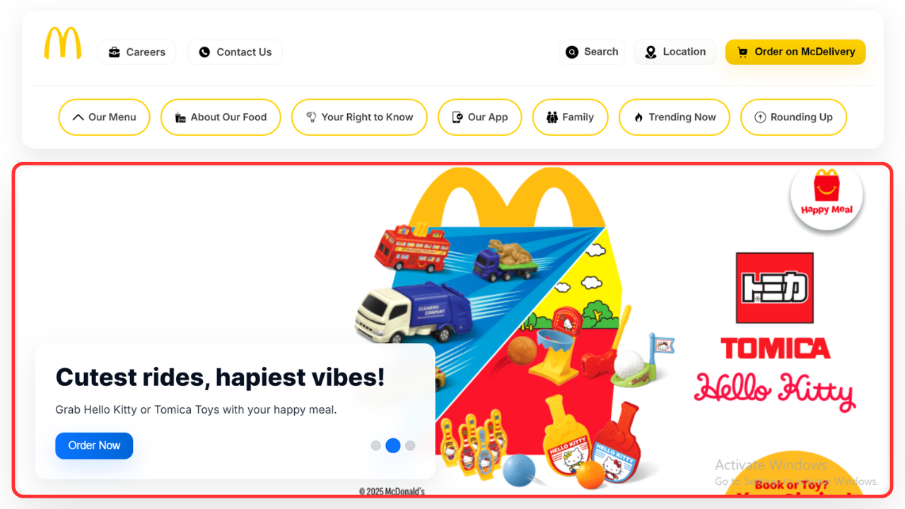
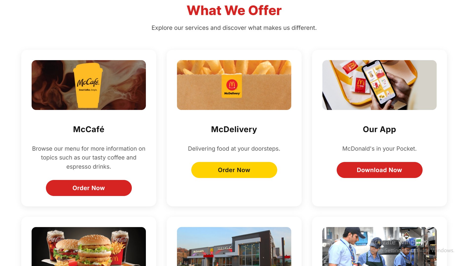
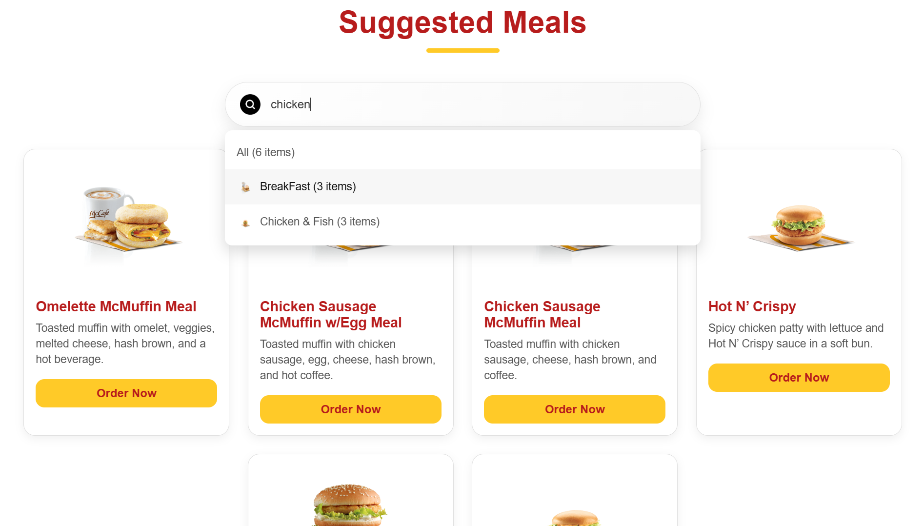
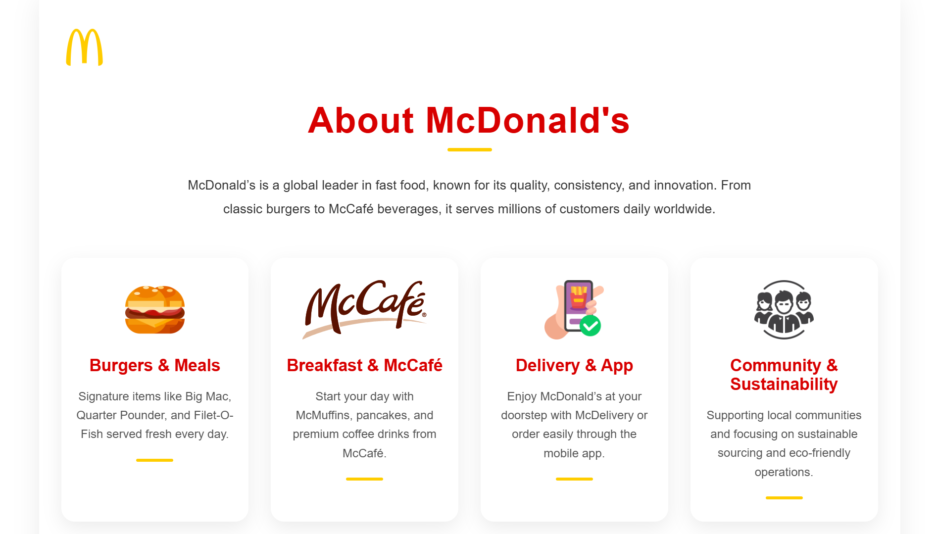
I'm thrilled to kick off this blog post by sharing my latest practical project: a complete redesign of the McDonald's website. This wasn't just a conceptual exercise; I personally developed the site to be fully responsive for mobile devices, breaking down the build into five core sections: the compelling Hero Section, the functional What We Offer Section, the personalized Suggested Meal Section, the informational About McDonald's Section, and a polished Footer. Demonstrating my hands-on expertise and experience in rapid prototyping, this entire redesign was initially powered by leveraging the capabilities of ChatGPT's free model. While the site is largely robust and functional—a testament to efficient development—I'll transparently point out that a few minor alignment nuances exist, primarily within the mobile responsiveness, which you can see firsthand by checking out the link provided at the end of this post.
